by admin | Aug 2, 2016 | cover, Fallout, Publishing, title, Uncategorized, Windscale fire
There’s no copyright on book titles. I didn’t realise that to start with and fretted that I couldn’t ever use a title that had been used before, but I can, although it’s still needs thinking about.
The easiest way to check is to do what I did yesterday – draw up a shortlist and then look each title up on the Amazon data base. I know it’s lazy, but it’s quick. Looking carefully at what comes up helps me to decide whether a previously used title could be used again. If the title has been used before, which almost all titles have, I look for various criteria:
- Was the previous book the same genre? I want a title for my novel: if the previous title was for non-fiction, it’s unlikely that someone looking it up would be confused.
- Has the title been used in the UK, or just in North America or elsewhere around the world? If it’s just in the US, for example, I wouldn’t hesitate to use the title again.
- Was the title previously used for a paperback, or just for an ebook? I publish in both formats, and I might still choose to use the title again, although I might slip down the priority order
- How long ago was the title I want used previously
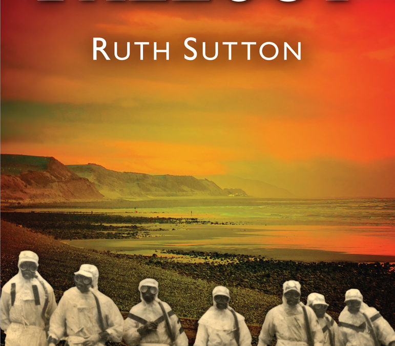
 ? If it’s within the past year or two, that could be a problem. In 2014, when I was looking for a title for my novel set in and around the Windscale reactor fire in Cumbria in 1957, the title ‘Fallout’ was an obvious choice, and I really wanted it. Just three months before we went to print another novel appeared with that title, published in the UK, and I had to make the choice. In the end I decided to go ahead, but I’ve noticed that since publication we’ve had two copies returned – which I guess arose from the confusion over the title. I still think I made the right decision, though, and the cover is pretty special too. ‘Garish’ someone called it, but at least it gets noticed.
When I’ve checked all these criteria, I find that some titles don’t feel so appealing, as they have been used before many times, and quite recently. The exercise yesterday brought the list of eight possible titles down to two or three, which was helpful. Once my trusty editor returns from her hols the fateful decision will be made and possible covers will then be designed. Still on schedule for publication in November 2016.
by admin | Jul 24, 2016 | cover, crime fiction, title, Uncategorized
 My editor and I are having a disagreement about the title of the new book. The first title I chose sounded fairly dull, and I wasn’t convinced. Then I opted for a phrase ‘Seize the Day’ which appears once in the book, and quite significantly, but right at the end. She feels that the reader might be annoyed that the title’s meaning remains a mystery until the very end. She also thinks that the abstract phrase would be hard to link to an attractive cover image. All this may be true, but I can think of many books where the cover image is a mystery, and the title too: the connections between them and the story are intended to be part of the riddle. Am I asking too much of my readers? Do titles need to be ‘literal’?
We’re now considering various alternatives, but the issue of a connection between title and cover image remains a dilemma. There are various themes and events in the book that could be picked up in both title and image, but which would be most effective? No decision is absolutely necessary for a few weeks yet, so I shall wait for inspiration – showing more patience and tolerance of uncertainty than is customary for me.
by admin | Jun 19, 2016 | cover, crime fiction, Cruel Tide, Morecambe Bay, Publishing, readers, self-publishing, title, Uncategorized
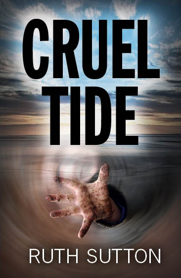
I always struggle with titles, and then with the cover image that should illuminate the title and engage the reader: as an independent author/publisher, these decisions are all mine. The image on the cover of ‘Cruel Tide’ developed before I even started the book. It came to me when I did the walk across Morecambe Bay and was struck by the menace of quicksand very close to the northern shore. The snaking, threatening tide that covers these huge mudflats twice every day connected with another cruel tide – of abuse, cover-up and corruption that have damaged so many children’s lives. The decision about both title and cover came to me quite quickly.
Not so with the sequel to ‘Cruel TideI’ that I’m currently completing. My editor Charlotte and I have brainstormed possible titles, but nothing really stood out. Then in the final stages of the first draft, in one of those times when the story seems to be writing itself, the words ‘Seize the Day’ became suddenly significant and I could see them on the cover, with a dark image of one of the settings – no details for fear of plot-spoiling.
The first thing you do is check how many other books already exist with that title. Of course there are several, but then you have to take them one at a time and decide whether the replication is significant. The most recent was non-fiction, an autobiography, so that was OK. Another appeared to be a religious tract, too different to bother about. There was one fiction book, but a very different genre.
I think I have my title. Next I’ll think hard about the image, and start working with the cover designer Kevin Ancient who did such a wonderful job with ‘Cruel Tide’. Crime fiction covers seem to be have some common characteristics, to ensure that readers understand what may lie between the covers. Decisions to make. Watch this space.
by admin | Jan 31, 2016 | promotion, Publishing, readers, self-publishing, selling, title
As any regular reader of my blog will know, I’ve always been puzzled by the complexities of ‘genre’ and its effect on those in the book business whose role is to decide what gets published and what doesn’t. Apparently in the latest edition of the ‘Bookseller’ magazine, which I haven’t seen myself, is an article about a new ‘sub-genre’ label ‘grip-lit’, a term used to describe psychological thrillers, such as ‘Gone Girl’ and ‘Girl on a Train’. (I’ve already noted the repeat of ‘girl’ in the title, to bring one’s work instantly to the notice of a literary agent.) ‘Grip lit’ is hardly a new idea; it’s been around for decades, displaced more recently by the new wave of ‘detectives’. Perhaps literary fashion, like its clothing counterpart, has a ‘retro’ phase, when the delights of a previous era are re-discovered and claimed by a younger generation.
If genre is indeed driven by the vagaries of fashion, writers like myself face some choices. We can scour the landscape of current trends to find what sells, analyse the component parts and imitate them as quickly as possible, before the trend fades. And if we’re really clever, we’ll use a trendy title book too. Alternatively, we could aspire to something more timeless and run the risk of being ignored by the bandwagons that sweep by so relentlessly. The beauty of aiming for the timeless is that the books’ shelf life is much longer. If you’re self-publishing in paperback – which you probably are as no agent is interested in anything so untrendy – shelf life is an important consideration. Self-publishers can’t afford the ‘launch’ and promotion budgets available to traditionally published books, and have to rely instead on steady sales over a longer period to get any return on the initial investment.
In the Saturday Guardian review section, a few pages on from the piece about ‘grip lit’, there is an article by Hilary Mantel about the life and work of Elizabeth Jane Howard. Howard’s work is often disparaged, with a genre definition of ‘by women, for women’. Mantel believes that this category existed ‘until very recently’, but I think it’s still around, and just as disparaged as ever. The difference is that now such novels rarely if ever penetrate the net thrown around the publishing business by the professional agents on whom the business now relies. Confusions abound. When does fashionable ‘chick lit’ grow up into unfashionable ‘by women, for women’? Is this another example of the confusing irrelevance of genre? Isn’t it time we dropped the whole labyrinthine idea, or a least cleared away the clutter and returned to a smaller range of overall ‘categories’ of fiction which is not defined by assumptions about who will read them?
by admin | Apr 19, 2015 | A Good Liar, cover, Cumbria, Fallout, Forgiven, historical fiction, Lake District, promotion, readers, self-publishing, selling, title
The publication of my second novel ‘Forgiven’ in 2013 felt very stressful, or at least that’s how I remember it. I felt it was better than the first one ‘A Good Liar’ and had certainly been easier to write, taking a year rather than the previous tortuous four year process. But I underestimated how long it would take to get the final stages of the publication business sorted out, and wanted to get it out into the shops as early as possible in the Lake District visitor season, when probably I should have taken decisions more carefully. Patience was never my strong suit.
The main frustration was about the cover. The cover of ‘A Good Liar’ had taken quite a while to put together and consisted of three parts: a old photo of schoolchildren to place the story in its time; an atmospheric picture of Wastwater to reflect the setting; and a profile of a woman to indicate that the protagonist was female. As one of the booksellers told me, ‘It’s a good cover because it tells the reader about what’s inside.’ When it came to part 2 of the trilogy ‘Forgiven’ I struggled first with the title, which doesn’t give much away, but did pick up one of the themes of the book, and I quite like one word titles. The setting was mainly west Cumbria and the town of Whitehaven in the immediate post-war years, with a family of coal miners at the centre of the action. The cover we ended up with was a gorgeous photo of the local landscape in spring, from a photo taken at about this time of year, when the valley floors were bright green with new grass and there was still snow on the fell tops. A lovely image, but it told the reader very little about the book itself.
From the outset, this book has sold less well than ‘A Good Liar’ and when the third in the trilogy was published the following year, that one sold better too. I began to wonder whether one reason for this might be the enigmatic title or cover of ‘Forgiven’. If the author’s name is well-known then I’m not sure that title and cover matter very much. But I’m expecting visitors to Cumbria to pick this book off a shelf and be interested enough in it to buy it, and why would they, really? They don’t know me from a hole in the ground. They need more at first glance than ‘Forgiven’ could offer them. For ebooks the cover matters less, but for a book on a shelf, competing with others in the reader’s view, the cover matters more.
If I’m right about this, I’m asking myself whether I should approach the reprint of ‘Forgiven’ as an opportunity to ‘re-brand’ it with a new cover. The title is fixed and unchangeable, but changing the cover would be easy and there are many precedents for doing so in the traditional publishing world. As a self-publisher I have absolute discretion about how my work should look, and this could be the time to exercise it.
So, I’m back to the age-old question, what makes a good book cover? The bookseller I referred to earlier takes the functional approach: the cover should indicate what’s between the covers. In that case I might need some reference to winter, hard times and to the pits, and perhaps some images of people of the period. In other words, I could use the same formula as we used for the first cover. Or I could use a more striking image, such as the one I chose for book 3 of the trilogy ‘Fallout’, and enjoy the mixed views that followed. The cover of ‘Fallout’ was designed to surprise, if not shock, the reader and succeeded in that intent, for good or ill.
I’ll have a few months to think about it as there are still enough from the first print run of ‘Forgiven’ to see us through this summer’s busy season. Is a picture of an old coal mine a turn-off for the largely female readership my books attract? Should I hold out for an image of the screen lasses, the remarkable women who worked on the surface sorting and grading the coal, despite the copyright issues that we ran into last time? It’ll be interesting to start again and take longer over the design than I did last time, and even more interesting to see whether a different cover affects sales.
The beauty of writing historical fiction is that it doesn’t have a limited shelf-life: it can be as relevant in ten years’ time as it is now. But the down-side of that agelessness is that it can’t burst upon a waiting world as something completely of its time, new fresh, contemporary. Within the historical fiction genre I’ve tried to avoid the Catherine Cookson cliches, and romanticising a past era that was challenging, complicated and fraught with ambivalence. The cover could reflect some of that at least, rather the rather bland if beautiful image it has at present.
Writing this post has made up my mind. I’ll start thinking about the cover of ‘Forgiven’ now and give myself, and the cover designer I work with, more time to make the best choice. And my new crime fiction book which is due out in November will need a brilliant cover too, which should be ticking over in the back of my mind from now on, while I’m still writing the first draft. Not for the first time, I realise that turning thoughts into words – written or spoken – helps me to pin down what I’m thinking about. I’ll be another year older this week, and beyond the age when my mother’s Alzheimers started. I keep looking for signs that my brain is seizing up, but for the time being, thank heaven, ‘cogito ergo sum’.
by admin | Mar 14, 2014 | A Good Liar, cover, Cumbria, Fallout, Forgiven, Lake District, self-publishing, title, Windscale fire
You may have gathered that since the ms. of my third novel in the trilogy went to the editor last month I’ve been thinking about the details of publication. This past week, driving around the flat wintry landscape Manitoba, Canada, I’ve been watching the colours of sky and snow and thinking about the cover image that will make my new book jump off the shelf or the page saying ‘Read me’ and, better still, ‘Buy me’. This is the image that will appear on my Amazon page and Twitter and everywhere else, and it has to be both telling and compelling.
One of the great things about self-publishing is that you get to make these decisions for yourself. Writing a book is such a personal endeavour: it’s always bothered me that someone else – or worse still a ‘committee’ – should decide what the finished book actually looks like. I don’t want to use images of people: the reader should be able to imagine what characters look like from the text, or from inside their own head. The cover of this new book set in such a wonderful location should reflect that place, and say something too about the events between the covers. In the case of ‘Fallout’ – yes, I finally decided to keep that title – the image could represent two central themes, the importance of the beach and its ever-changing light and tides, and the fire deep in the nuclear reactor burning red, orange and blue. Sunset over the beach could fulfill both of these hopes in one image, if we could find the right one and not have to pay too much for the copyright. If that sounds mercenary, it is. Self-publishing a real book, as well as an electronic one, is an expensive business, but it’s what I’ve chosen to do. I love books, the look and feel of them as well as their contents. Creating a book continues to be a real pleasure, and one that has to be paid for.
When ‘A Good Liar’ was published, the cover captured the key elements of what lay inside. There was a stunning image of Wastwater under a stormy sky, contrasting with a faded grey picture of rural schoolchildren, taken in the very year of the book’s setting. The cover of ‘Forgiven’ was a gorgeous photograph of a lush green Lakeland valley and a granite wall, taken by my book designer John Aldridge, combined with a bright sky from a different location. This third cover, on the last book of a trilogy entitled ‘Between the Mountains and the Sea’, will focus on the Irish Sea of the West Cumbrian coast. Somehow I hope we’ll find the image that delights me and anyone who chooses to read the words inside. Let’s hope the bookshops will find the space to display the cover rather than the spine. I can’t wait to see it.
Recent Comments